Ever visited a website that felt cluttered and confusing? You weren’t alone. Without a clear visual hierarchy, websites can overwhelm visitors and make it hard to find what they’re looking for. But fear not! Here at RoboDigit, we’re web design ninjas, and we’re here to show you how to use visual hierarchy to create a website that’s both stunning and user-friendly.
Think of your website as a conversation. You want to guide your visitors through the most important information first, just like you wouldn’t blurt out your life story on a first date. Visual hierarchy is like using clear body language and vocal cues to keep your audience engaged and interested.
Here’s the problem: When everything on your website screams for attention with the same size, font, and color, visitors get lost in the noise.
Imagine this: You land on a website with a giant flashing banner ad, a wall of text, and tiny navigation buttons crammed into the corner. Where do you even look? This is a recipe for visitor frustration.
The Solution: Let’s organize your website like a well-designed magazine.
- Headline Heroes: Use bold, large headlines to grab attention and introduce your main message. Think of them as the captivating cover story that draws you into a magazine.
- Subheading Sidekicks: Subheadings in a slightly smaller font size offer supporting details and context. These are like the informative snippets that pique your interest in an article.
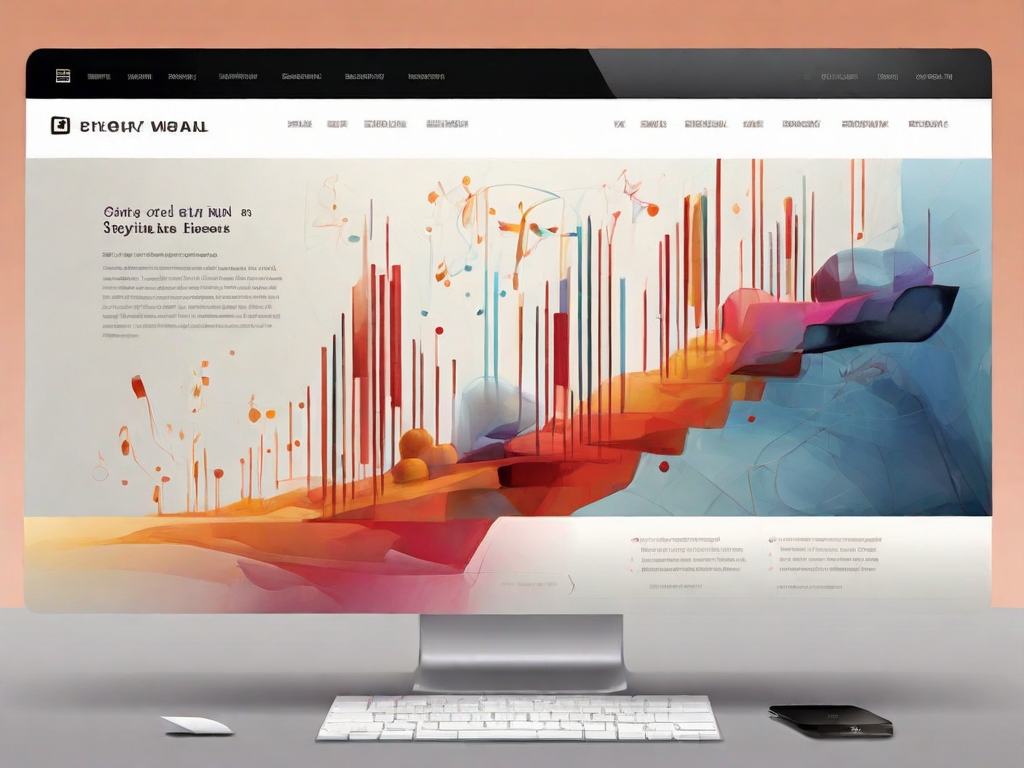
- Image Impact: High-quality images and videos break up text and visually represent your message. Think of them as the stunning photographs that bring a magazine to life.
- Color Confidence: A strategic color palette can highlight important elements and create a mood. Imagine a calming blue background for a spa website or a vibrant red button for a call to action.
- Whitespace is Wonderful: Leave plenty of empty space between elements to avoid clutter and create a sense of balance. Think of it as the margins in a magazine that make the content easier to read.
- Call to Action Clarity: Make it crystal clear what you want visitors to do next with a prominent call to action button. This is your chance to convert a website visitor into a paying customer!
By implementing these visual hierarchy tips, you’ll create a website that’s easy to navigate, visually appealing, and helps you achieve your business goals.
Ready to transform your website and turn visitors into raving fans? Contact RoboDigit today for a free consultation, and let’s create a website that gets noticed for all the right reasons!